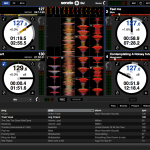
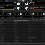
Serato DJ screenshot interface (3)

Serato DJ Interface – Our Thoughts

Serato DJ interface first look

After a solid period of gestation and rationalisation, Serato have announced their future plans, and the first part of that is a replacement for ITCH. Called Serato DJ, this was unleashed just before BPM, and alongside it was the first dedicated hardware in the shape of Pioneer’s DDJ-SX controller mothership. And while we could see the hardware, and indeed did paw it and film it at the BPM Show, the Serato DJ software was conspicuous by its absence. But the kiwi fruits of their labours is now here – Serato have sent through a plethora of screenshots of just what Serato DJ will look like in a couple of weeks time.

Serato DJ Interface – Our Thoughts

First Impressions

The first thing that struck me is the look and feel. Serato have recently rebranded – out with the old logos, colours and typefaces, and in with monochrome and Helvetica Bold/Black. The Serato site has clearly had a slew of designers and web people thrown at it, and this has rubbed off on Serato DJ’s user interface too.

That said, it’s taken on a decidedly Traktorish tone. It’s not quite 50 shades of grey, but there’s a lot less pure black than there was. It’s also very flat and eschews the graphic exuberance of phone interface designers. It would be easy to make it prettier and more graphically attractive, but given the sheer volume of info needed onscreen by DJs, it may well have destroyed the user experience in a carcrash of drop shadows, vignettes and funky animations. The doesn’t mean I don’t want to see that of course, but for now I’m happy with the look and feel.

If this is the future look for SSL, then it’s clear that Serato are at least making the interface more attractive to Traktor users. I feel that it’s only now that it’s getting the polish that Traktor has had for a while now.

Serato DJ Interface – Our Thoughts

“It’s a bit busy isn’t it?”

Hell yes. But let’s remember that we’ve been given 1280×800 screenshots, so not much different to an 11″ MacBook Air. The 13″ model I’m typing this in on is 1440×900, and most likely is a more common resolution for many DJs. I think Serato have simply sent a worst case scenario through. So before I get too picky about how cramped and busy the layouts are, I’ll reserve judgement until I’ve seen them on a 15″ screen.

Serato DJ Interface – Our Thoughts

The New Effects

One of the major additions to Serato DJ has been the inclusion of iZotope effects. Looking at the screenshots, we can see banks (A-D) of effects, with 2 FX units available, and each one being assignable to decks 1-4 or the master. While we can only see 2 almost certainly carefully chosen effects, the wealth of controls over them puts the effects in an entirely different realm. I would expect complaints on the Serato forums dry up in no time. Well apart from SSL users who will feel left out of course.

The Main Layout

So the changes – toggling elements used to be done under the decks, but this bar is now at the top i.e. always in the same place and not dependent on how you have your deck view. You can see the 2/4 deck toggle as well as a drop down menu for layout options. So in this respect, the layout has become more logical. We’ll just have to wait and see how this works in use, but from the screenshots provided, there seems to be a good deal options over deck and waveforms and just how they display.

If you compare and contrast  the 2 deck complex view with the 4 deck library screen – you soon seen just how busy or empty the screen can be.

I don’t really care for the deck display and never have done. All I see are big white circles with ill-placed proportionally spaced numbers randomly scattered inside. I’m sure the info is very useful to a lot of people, but I personally look at the waveforms to see where I am in a track. For me, this needs some more thought, although I’m not sure exactly what can be done.

Loops and cues get some improvements. Depending on your preference, you can now display 8 loops, 8 cues or an even split of both. There’s also a handy icon to toggle between them on screens with limited space. Yes – that’s 8 hot cues.

And seeing as beatgrids are a standard feature of just about everything nownow, Serato DJ makes it a lot easier to create and adjust them too. The offline edit mode looks to be much easier to use for this too.

Serato DJ at the DJWORX studio
No, I don’t really have Serato DJ. It just looks like it.

Summing Up

It has been my contention for a number of years that Serato needed to rationalise their software offering. Having different products with a core feature set seems silly. And to me, with Serato DJ we’re heading towards that common base software, with everything else plugging into it. I suspect that this is the first step towards seeing Scratch Live becoming an add-on. I’d love to see a time where an API appears, where different developers can create their own add-ons and plugins. Fingers crossed, although I imagine that Serato will remain a locked tight product for a long time.

To address the feeling that Serato DJ is too busy. Well sorry dear reader but it’s your own fault. You continue to crave more features, but still want it all onscreen, and then complain when it suddenly looks a wee bit crowded on your 13″ laptop. Back in the day when Serato ruled the DJ world, their feature set was small, thus reliability was guaranteed, and the user interface was more empty space than useful info. But those days are gone, and Serato now have to find a way to deliver what you need in a coherent way. Thus the empty space is filled with SP-6 and iZotope effects controls, and more loops and hot cues.

One thing is for sure – software vendors are going to have to find smarter ways to use the screen real estate available to them. If you have a 27″ iMac, it’s dead easy to plonk every single control onscreen and still have space. But when the tool of choice is a 13-15″ laptop screen, they’re going to have to work harder on fitting all that stuff in. Were at breaking point now, and that’s without all the cool gubbins that the next 5-10 years will bring forth too.

Overall, I feel that Serato have done a good job with the Serato DJ interface. It’s better looking and manages to fit a lot in while still offering users scope to customise things how they want. I still reserve final judgement until I’ve seen it on a bigger screen and played with it in more detail.

The Old Owner
    1. if you’re audience is busy looking for a sync button on your gear, then you must be doing something terribly wrong. if you’re gravely concerned with what other DJs will think about you, then your priorities are out of sorts.

    2. You want OG street cred? Scratch. I still live by the Egyptian Lover requirement: “What is a DJ if he can’t scratch?” And I think that with all the technology out, scratching is one skill that still elevates the above average DJ from the rest.

  1. At first I though the new gui would be cool, but after seeing the pictures here is what I have noted :

    – lots of buttons are now on the deck (play, previous, next) but also direct auto-loop access. What for ? We use controler we only need feedback sometimes. Is this a move for dj using a mouse ? It as only made the interface cluttered and everybody spitting on it…

    – the colors : those big white circles will make the screen more bright/flashy in spotted area.
    All that blue (what if people doesn’t like blue ?).
    + channels vu-meters for controler that can afford this
    + now you can’t deny it is a real serato product

    Waiting for information on the midi inputs (what can or cannot be done) and the fx parameters (handling with existing controler).

    1. The extra on-screen info makes a lot of sense for their upgrade model. This is an upgrade for users all the way back to the VCI-300. If you are removing any ability to toggle the functions on-screen (lets say, if you don’t have an externally mapped controller…..yet) then users will get pissed. This gives “open” access to all the new goodies for everyone getting the upgrade.

      1. Yes you’re right from that pov, but mixing with a hand on a mouse/pad have never been in my book and won’t. If you want to upgrade, then upgrade at least with an additional controler, they’re very cheap nowadays.

  2. Does anyone have any idea how many people use which software? I’ve done some very un-scientific studies involving searching eBay for “Serato” “Serato Vinyl” and “Traktor” “Traktor Vinyl” in different countries on eBay.

    In the US “Serato” returns a lot (3.5 times or so) more results, in the UK “Traktor” returns a few more results but once you take out “traktor” referring to what we call “tractor” in the US, then they’re about the same.

    Searching for “Serato Vinyl” vs “Traktor Vinyl” puts Serato at a higher number, but that could be because more Serato users tend to use vinyl, and more Traktor users control it without a turntable in sight.

    My sense is still that more people who gig more than 5 nights a week use Serato (I know that some famous, talented people use Traktor of course). Anybody know any tangible specifics about all this?

    I use Serato but I’m not married to it. I’ve had a very negative experience with Serato customer service (not Rane, who is excellent in that regard) but I suspect it’s still better at solving the problems of real-world DJs even if it does less whiz-bang stuff. Call it my software-engineer’s instinct…

    rs

      1. Sorry if that was a distraction from the thrust of the question. I’m not interested in internet sophistry and wasn’t trying to encourage it here.

        Reducing that to 2 or 3 nights a week broadens the pool a lot. But the “real-world” question I have remains the same.

        Do you have any insight into the original question? Does anyone else? Someone out there work at a music store, for instance, and have a sense of which one is selling better, and at what price levels?

        rs

  3. Well I’m glad to see the beat grids are easier to set because the purely keyboard shortcut method was a pain. Still though, I wish setting beat grids was as easy as it is in Virtual DJ. In Virtual DJ you can assign a key on your keyboard and simply tap along and the beat grid will lock itself in from the beginning of the song to the end after just a couple of taps. ITCH on the other hand requires that you scroll through the entire song and check every downbeat which is verrrrry time consuming and is the main reason I don’t use the beat grid in ITCH… it just takes too damn long!

  4. You know, the more I look at it, the more I like it. I like having the ability to switch between 4 Cue Points and 4 Loops or 8 cue points, etc. I would love the ability to switch features on and off, like not having the Time visible, but instead being able to have 8 hotcues and 8 loops.
    Still only an SP-6, though. I was hoping for an SP-8, or something. BUT having 24 sample cells on top of four decks is kinda awesome.
    I’d also like to have more than one panel open if I have the screen real estate, though, I’d also like to be able to switch from full deck view to full sample deck view or something. Have a real modular approach, if I need it at the time. :)
    That 4 deck view with everything open is kind of madness, obviously, but we gotta see it on a larger screen first.

  5. I agree that the screen real estate (GUI) is becoming a mimic of Tracktor – load of options and info but not so useful when it comes to controlling them on the fly. A reason I never like Tracktor and chose Serato instead.

    It begs the questions as to why build a controller full of functionalities only to have these duplicated on the screen. What is the real purpose and the drive behind the GUI development?? Is it to lure DJ into using their trackpad to navigate Serato DJ software in order to achieve certain functionality they so desire or is it to only display key but vital track info so that they can continue to rock the dance floor on the fly?

    My analogy of hardware/software via PC integration is like comparing the HUD display on an F-18 and all the buttons there is available in the cockpit. You don’t see every single info for every single button is displayed on a HUD, only the vital ones!

    Not sure about everyone else but I have become so dependent on the track waveforms to choose my next song on the fly. The colour waveforms give out a lot of info about a track – for examples, vocals, base, rhythm, and event type of instruments in most cases. Similarly, album arts allow me to choose which version of the same song or quickly on the fly to pick out the one I recognize by the album art. The point here is that visualization is an important and vital part of hardware/software via a PC integration that GUI development must taken into consideration. Let hardware controls the robust functionalities of the software and let the software display vital info only. Lose the duplications is all I am saying.

    1. 100% agree. The problem, though, is then the interface needs to be modular, or customizeable so the user can change it based on what their controller can do. If I have a controller that gives me 1-to-1 sample deck control, I should be able to turn off everything I don’t want, but still have it. :)

  6. This GUI is definietly Serato, not Traktor, not VDJ.

    Serato hasn’t changed this design much since day 1 becuase it aint broke, so it doesnt require to be fixed.

    I like the simplicity of their design. Seratos GUI doesnt say much but it does allot and it does it reliably.

    Im not impressing my audience with my laptop screen, they’re focused on my musical set.

  7. I’ve never really understood the point of having all that information on screen when most of it’s replicated on the hardware (or redundant on screen) in some way, but that library view looks absolutely gorgeous. Track info, a track waveform, and a huge browser, everything you could need onscreen.

  8. Where are the views that allows the decks to be stacked? On Scratch Live and Itch there’s an option to stack two or four decks and it’s the best layout I’ve ever seen. Where is it?

  9. Why are the white circles so big? They waste so much space. There’s nothing actually spinning anymore when using a controller (except V7/NS7) and not turntables or CDJs so it seems pointless to dedicate so much space to these white circles.

    1. The white circles show rotational position… Something I wish Traktor Pro had… It may not be useful to all DJs using controllers, but it does provide a method to juggle beats the “old school” way using stationary jogs. …and before anyone says “I can juggle beats using one deck and cue points” there is a lot more nuance in juggling / scratching two decks that can’t be emulated via cue points…

      1. I know what they’re for and what they represent, just wondering why they have to be so big. SSL and Itch have two extra view options that stack the decks and make the white circles much smaller while opening up space for everything else. Can’t find those two views on Serato DJ.

    2. I love the big clock style spinning rotation! It tells me where exactly on the track I am at on first glimpse. When do you look down on a controller platter and know where you are on a track? Not quite. So having elapse and remaining times display are key. Not sure about every body else but I look at the screen to find out where I am on a track and which cue points I have and have not elapsed and then I look at the overview waveform see where the phase in and phase out begin and then at the waveforms just to get the sense of the track’s DNA to get ready for the next cue track. I love the big BPM display also.

      1. Me too. I think they also help “centre” me within all the screen real estate.
        Could the info in them be utilized better? Probably but it’s not a big issue to me.

  10. How about making it modular for the user to build up his or hers own GUI? Drag n drop a crossfader if you need to see that, add a large waveform, pick big knob eq for whatever reason and you get to see what you need! It’s crazy to think that one GUI will fit all (even though you probably can choose 2 deck, 4 deck, big mixer etc a la traktor). And for effects … just let it support vst plugins like Torq does/did … problem solved. Not trying to be Captain Obvious but it seems so easy to find a solution for this…

  11. I would like to know just how much of the on-screen information is vital and not just duplicating hardware feedback, and how much of that duplicate information can be safely hidden (the article mentioned layout customization). While I recognize the need to be able to confirm that one’s controller is operating correctly, Serato’s increased control over hardware compatibility would suggest that they are moving toward a kind of standardization that would, to my mind, facilitate a shift toward greater dependency on controller-based feedback (thereby freeing up screen space).

  12. “The 13″ model I’m typing this in on is 1440×900, and most likely is a more common resolution for many DJs.”

    Really?
    Most DJ’s I know are on a 13″ MacBook Pro (not Air).
    So the most common screen resolution is 1280×800.

  13. two decks in offline would be nice for those long train/plane rides so that we could work on building mixes.. Just cue points and an ability to adjust BPM would be perfect,

  14. I want to change the “View” of my Serato DJ. For some reason I only have the screen that is in the first thumbnail but I want the view with multiple decks. I followed all of the download instructions from the site. Help is much appreciated!